* No badgers were harmed in the creation of this blog *

** Not intended to diagnose, treat, cure, or prevent any disease
**

Sunday, September 25, 2022

Build thread - Luigi's Restaurant - Assembly

First Post | Previous Post

With the individual walls assembled, it was time to paint their interior faces black. This serves to prevent light leak through the plastic once a light source is placed inside (the walls will appear to glow otherwise). I could have also painted the insides of the window frames, in theory, but I didn't see a way to pull that off without painting out the glazing at the same time. My hope is that any glow of the window frame will be interpreted as being due to the light streaming out through the glass.

Of course, paint will get in the way of the plastic cement, so you'll need to either keep it away from the areas you need to glue, or scrape it away after. The wall edges of these kits are mitred, and Keeping the paint clear form the mitre was straightforward enough. I also had an idea of adding internal struts and other reinforcement, since I've seen plenty of seam failures in this type of construction. I scraped the paint away to allow for this extra construction.

Even as late as this stage, I still wasn't clear on what I was going to do for an interior. If I had been, I could have measured and installed supports for bracing at the same height on each wall, installing angled beams like inverted capital Ls. This would have both supported the floors, and served as a gluing point for diagonal bracing between adjacent walls. Instead, I scraped off a rough patch of paint and then put the first two walls into a right-angle jig to glue them together. Using the same liquid cement, I first painted the mitre joint, then added square plastic rod stock on the inside of the mitre with some more cement. Once this had dried, I painted it the same matte black. Once the joint and reinforcement had dried, I cut some more of the square rod at a 45-degree angle, and strung them across the corner, cementing them in place.

I repeated these steps with the next joint, giving me a three-walled structure. At this point, I had to stop to think further. Once I added the back wall, I'd be closing off my options for the interior. The biggest issue was the picture windows in the storefront, which would now look onto a mostly blacked-out interior. On test assembly, I discovered that the lettering on the glass would be lost against that dark background. I had collected both stock images of office interiors, and HO scale office furniture, so a detailed interior was an option, but now that I had assembled three of the walls, adding that interior would not be easy. And, for my first model in a long time, maybe this was becoming more complicated than was reasonable. The model sat for several weeks in this unfinished state.

Years ago, I had worked in the theatre, where we sometimes used diffuser gel (also known as diffuser filters) over our lights. This is a thin, translucent plastic material made specifically for shining light through it, to soften harsh shadows. There are a few manufacturers; I went with Rosco for the simple reason that I was most familiar with them. I used their #250 diffusion gel, cutting a small rectangle out and wedging it in front of the picture windows. This both spreads out any interior light, to better illuminate the windows; and shows off the lettering, even if/when there is no light.

At this point, I had basically backed myself into a corner regarding the interiors. My diagonal braces were at different levels (since I hadn't measured and used supports for them), so any interior would be lopsided, and I no longer needed one, either. I glued the three walls in place on the base, reinforcing them with more of the squared rod. The base is designed with sidewalks in front of, and behind the building. I'm not clear on the thinking of this, but in my case it doesn't matter, since the back of the building (and thus, its sidewalk), is hidden by the building. If it matters in your case, cutting off of the back of the base is straight-forward enough. I wanted to be able to slide the model to the back of the shelf it will sit on, so I made this cut. The pattern on the sidewalks is of small squares, with a separate curb and curbing along the property lines. Short-shortsightedly, those property lines don't allow for the alley needed to access the side door to the upper floors. Thus, for a realistic presentation, the original sidewalk has to go. One option is to reuse the front and rear sidewalks, splicing them together to run the entire distance across both the building and its alley. Another is to use aftermarket sidewalks. In my case, I did neither, since the building will just be on a shelf, and to make things a little easier on myself. I primed the sidewalks, then took dark grey paint and randomly splotched it across the sidewalk tiles. This blotching will show faintly though the next layer of paint, giving the surface a variegated, more lifelike look. Once this dried, I painted everything ivory. Then, I took some light grey and repainted several of the tiles, as if they were poured later, as part of a repair; and did the same with some darker grey. Finally, I dull coated everything, and hit it with a coat or two of the India ink to tie it together and darken the lines between the tiles. With the base complete, I attached the three walls to it, reinforcing the join with some more of the square rod stock.

The roof of the kit is designed to be sandwiched in by the four walls. There is a ledge along the walls, near the tops, where it sits. Above that ledge is a thin space for the roof, then raised detailing to show the brick inner face of the wall along the roof. In practice, I found that the raised detailing is low enough that the roof can be added after the four walls are assembled to each other, but I test-fitted to make sure. I reinforced the rear wall's joints with rod stock in the corners, but getting diagonal braces in would have been quite difficult. If I had added some L-brackets during assembly as gluing points, adding diagonal bracing now would have been much easier. Again, lesson learned.

This completes this build thread.  I hope you enjoyed your time here.

First Post | Previous Post

Wednesday, September 21, 2022

Build thread - Luigi's Restaurant - Fire Escapes

First Post | Previous Post | Next Post

When I think of a city, I think of New York; and when I think of New York, one of the things I think of is fire escapes. As an actual safety device, they're dubious, due to their sad habit of peeling off of the building when they're in use. Many were retrofit, starting in the mid-19th century, and in this case they were typically just bolted to the face of the building. Even without years of neglect, the building wall was never intended to hold their weight, plus the weight of people trying to escape. If the escapes were part of the building's design from the start, they could be bolted to the opposite side of the building. With proper engineering, this provided a much stronger attachment, but years of neglect and rust means that many extant examples no longer have the strength they started with. New York banned external fire escapes from most new construction starting in the mid 1960s, requiring instead an internal fire stair, which now tends to be the strongest part of the building. Nevertheless, they were state-of-the-art for about a century, plenty of buildings still have them, some of them feature decaorative ironwork, and I've always enjoyed their look. In some communities they function as balconies (often illegally), leaving a lot of opportunity for modeling interesting scenes. Even if they're not in use, they add visual interest, so they were a natural item for me to include.

After looking at a few options, I went with the Vintage Fire Escape set by Walthers. This had a look I was happy with, for the most part, and didn't use any photo etch parts. I have no experience with photo etch, and though I would like to change that, my fist model when getting back into the hobby didn't seem the right time to do so. I also considered a set by Tichy, but the only one I could get my hands on had vertical ladders. I guess those are found in real life, but I don't remember seeing them, and it wasn't the look I was going for. My hoped-for model would have the bottom stair vertical, since that's what I'm most familiar with, but I didn't see any kits with this feature.

This is another example of learning as I went: first, the cornice above the store front (i.e. below the second floor windows) sticks out too far to allow for a fire escape. Specifically, the ladder down to ground level would crash into the cornice during installation. I've seen this problem in actual buildings, and the solution has been for the cornice to be trimmed back in the relevant locations, but doing so on the model is easier before the parts are assembled. I made the cuts with a sprue cutter, since it cuts flush. The plastic discolors as it's cut, meaning that my decision not to paint had consequences here. I decided that during the installation, the cut-away cornice was tarred over, and so was able to black out the discoloration. Since the fire escape is also painted black, the cutout isn't very obvious. I also had to cut through the architectural detailing to allow the struts for the bottom balcony to reach the brick walling. I could have cut the struts short, and had them rest on the detailing, but the struts include an expanded region where they meet the wall - in the real world this allows for bolting the strut in place; in the model it gives more real estate for the cement to work with. A cut-short strut would lose this real estate, leading to a weaker bond between the escape and the wall.  As with the cornice, I've seen these types of adaptations done in real life. Once the balcony was in place, and the glue was dry, I again applied black paint around the openings as if tar had been used to seal them.

The other layout lesson I learned centerd on the swing stair.  The bottom level stair's counter weight intrudes on the doorway to the shop, and the stair extends to or beyond the edge of the building. The kit is unfortunately limited in forcing the ladders to only run down to the right (to the left, if you're looking at the building from across the street). Since I had already laid out the building with the bedrooms behind the right windows, (I was still entertaining the idea of a partial interior) and the middle and left windows for the living room, I was stuck with either putting the fire escape only in front of the living rooms, or having the stairs stick off the right edge of the model. I chose to do the latter.

I primed and painted  the fire escape with Tamiya spray primer and gloss black, then took some Testor's flat black and semi-gloss black, working them in randomly to give the look of a repeatedly-repainted, repeatedly-faded and chipped fire escape. There's no real reason that I used Testors for this, other than that's what I had. Diving deep into my paints, I found several variants of rust, and applied them, too. Rust tends not to be a solid color - I think it starts out brighter and darkens with age - so using a single color to depict it can look odd. Less is more here, and I ended up repainting some of my rust to black.

The kit goes together easily. Scrape the paint from the areas where you'll apply cement - this is particularly important here since the parts are thin and there's not much plastic for the cement to work with even after you've scraped the paint away. I think I had one seam that came undone and needed regluing. There is a lip along the balcony railings where they fit on to the platforms, making it easy to line things up.  I later discovered that one of my corners didn't come together properly, but I suspect the error was mine, rather than a shortcoming with the kit.  Best practice is to figure out where on the platform the stair will need to attach, and scraping the paint before adding the balconies to the model, since access is easier without the building's wall in place. This goes for the stair railings, too. I attached the bottom-most ladder to its balcony prior to attaching the balcony to the building. There is a small piece with two steps that goes between the wall side of the swing ladder and the balcony (see the last photo), which would be difficult to add later. Since the ladder is actually sandwiched between this piece and the outer railing of the balcony, I added the ladder during the construction of the bottom balcony. Note that this ladder actually swings freely, and so can be modeled in an up or a down position. The mortar lines on the brick formed a natural level for me to line up the balconies with. If I had painted the walls, I'd have scraped it away where the balconies attached, then used a dab of black paint to cover the gap, as if the repaints on the fire escape hadn't been carefully applied. Alternately, I could carefully reapply the appropriate wall color and blend in the weathering, perhaps adding a rust stain if the blend wasn't convincing.

Adding the bottom balcony led me to realize that the second floor's bedroom air-conditioner protruded so far out the window that anyone climbing down from the third floor would have to climb over the air-conditioner to get to the final ladder.  From a safety perspective, this is a problem, so initially I put everything down to reconsider.  On reflection, though, I realized that safety-hazard or not, this is commonly done, meaning that from a realism perspective, I hadn't lost anything.

Once the balconies had dried in place, I found they were attached solidly enough that I could add the ladders without difficulty. This requires test fitting, trimming, and test-fitting again. The handrails were a puzzle at first. The story height of this model must be less than Walters counted on, meaning I had to trim the ladder beyond the length of its associated rail. The solution was to trim the topmost upright off the then attach the top of the railing to the balcony above.

Once the fire escape was in place, I used both black paint and rust to touch up any chips from where I had removed paint to apply cement or had to trim parts back. With everything else done, I could now finalize the rust and the varied sheen of the black paint. The final image shows more rust and more gloss than is generally noticeable, due to the flash and close-up. If I do this again, though, I think I'll pay more attention to getting my flat and semi-gloss into the railings, rather than just on the front, as I appear to have done here. Even with that in mind, I'm happy with the result, which is of a typical fire escape, as seen in any city.

First Post | Previous Post | Next Post

Friday, September 16, 2022

Build thread - Luigi's Restaurant - Windows

First Post | Previous Post | Next Post

As with the walls, the windows were molded in the color I wanted them to be, so I didn't bother to paint.  Unlike the walls, I haven't run into any problems stemming from this decision.  All of the windows are on a single sprue, facing the same way, so painting would be a snap, but I'd then have to scrape the paint away from the gluing lip where they attach to the wall.  Casting is good, with all of the window lites patent and no flash to cut away.  A sheet of clear plastic (acetate?) is provided for glazing.  As I mentioned in the first post, the kit provides optional panels for bricking over some of the window openings, but also provides enough windows to have them in every opening.  Since I had bricked over two windows, this left me with two extra windows.  I also had a few windows from the last time I built this kit.

The windows are sash windows.  Care must be taken to install them right side up.  As viewed from the outside of the wall, the upper sash sticks out more then the lower pane.  The inner surface has two levels, with the lower sash sticking out (see first image).  This means that if you use a single piece of glazing for both sashes, it will have to fold over the transition between the upper and lower sashes. Cutting separate pieces for the upper and lower sashes eliminates this problem

My first step was to treat all of the windows with several coats of the dilute India ink I've already described.  I used the same large, soft brush, concentrating on the part of the windows that would show., and keeping away from the gluing lip.  The plastic used for the windows is relatively soft, and using a number 17 (chisel) blade, you can punch out the lower sash by fitting the blade against the window frame and pushing in. Doing so keeps the window frame intact, but leaves the sash too small to reposition and reuse.  I tossed them into a small parts container for later use - I think they'll look good in a dumpster if I do a later kit where the windows are being replaced.  Even the sashes that came out broken would be useful in this regard.

Since the original sashes couldn't be used for raised lower sashes, I cut new sashes from the extra windows.  Each donor casting can provide two bottom sashes.

I first cut away the gluing lip with a number 11 blade, then switched to a number 17 chisel, fitting it at the seam between the upper and lower sashes, then working outward to separate the casting into an upper and a lower half.  Finally, I removed the raised remnants of the window frame, giving me a flat, thick edge on the sash.  I could have simply installed the lower sashes backwards (inside-out), but the muntins are molded with a thinner side facing out, and for the lower sashes to visually match, they need to be installed outside-out.  The second image shows the frames with their lower sashes removed, and the separate sashes I made from the extra windows.

At this point, I glazed everything, using canopy glue.  I used a toothpick to transfer a drop of glue to the sash, then placed the glazing.  There's probably a better way, since I frequently ended up with glue on the visible part of the glass.  Canopy glue dries clear, though, so the results look like cracks in the glass rather then giant blobs of out-of-scale glue.It's not what I wanted, but not terrible.

Two of the windows on the second floor have window A/C units.  I found these on eBay.  They're two different types, even though my vision of the building's interior is that each level is its own apartment. One is visibly larger than the other, and the initial plan was for the larger unit to go on the side window, since that window looked onto a larger room.  Unfortunately, the small unit didn't go together quite right, so I moved it to the side, where it would be less obvious. The larger unit is a solid casting, only needing paint; it moved to the front window.

The smaller A/C unit arrived as a flat piece with scores, designed to be folded into the three-dimensional model and glued in place.  I found that the part folded easily enough, but the liquid cement failed to hold it into its folded shape.  Clamping and/or thicker cement might have solved this, but I added scrap styrene to the interior to serve as extra gluing points.  Even then, one of the edges failed to hold, and the finished unit has a trapezoidal shape, with one open seam.  The model was also designed to protrude into the window frame, as a real unit would.  Since this would have required careful fitting of a shroud between the A/C and the window frame, I instead cut the A/C flush with the window frame.

For both units, once I had primed and painted them, I attached their inner face (i.e. the face that would face into the building) to a scrap piece of styrene, leaving extra styrene all around; then trimmed the styrene flush with the top of the A/C unit.  This styrene forms the shroud that is typically seen between an A/C unit and a window frame, since the window is typically wider than the A/C unit.  These shrouds tend to be white plastic, so I left the styrene untreated.

I fitted the air conditioner into its window frame, making sure that the unit sat snugly against the bottom of the window frame, then glued it in place.  The smaller unit includes legs to support its weight, but they were too long once I had trimmed the unit to properly fit in the window. When I trimmed the legs, I trimmed them too much. I'm still not sure how I managed that, since I did test fit, but done was done. My solution was to wedge a strip of wood (from a toothpick) between the legs and the building wall, as if a strip of wood had been used to better distribute the weight of the A/C. I painted the wood once or twice with the same India ink wash to give it a weathered look.

Once the styrene shroud's glue was dry, I glued the upper sash in place, then added a strip of styrene bar stock along the bottom edge of the upper sash.  This both eliminated any gap I might have inadvertently left, and reinforced the entire assembly. I made the bar stock long enough to extend over the frame of the window casting, so the weight of the A/C is carried in part by that frame, not merely by the shroud. The fourth image shows the completed assembly, viewed from the interior of the model. Note that I took this image at a later stage in construction; all of the window work was completed with the walls still separate.

I was still thinking about modeling some of the interior, and of lighting the model, so window treatments were important. The kit comes with a sheet of paper window blinds, but those are opaque. I found printable decal film on Amazon - it comes in both clear and white. I printed various patterns for Venetian and pull down blinds on clear film, then applied these decals to the inside of some of the windows. The opacity of the color is a lot less then I anticipated, but it still looks correct, probably since the printed lines are so small. If you go this route, note that decal film comes in both ink-jet and laser types, and you need to get the type that matches your printer. Further, the ink-jet type needs to be clear coated before you place the decal in water, or the ink will float free from the decal.

I also printed out decaling for the picture windows on the first story. Here, I wanted gold lettering spelling out "Clyde Bruckman, Life Insurance". Note that since the decaling was to go on the inside of the glazing, the letters had to be printed backwards.

The first attempt looked good when still on its backing paper, but once I moved the decal to the glazing, the yellow text got lost against the clear background. Giving a black surround to the lettering solved this problem, but the unprinted areas of the decal gave the window a blurry look, and the blurry look was uneven, so I discarded the second attempt, too. I found clear acetate that can be printed on with an ink-jet printer, and this solved the problem. Once the ink dried, I applied these windows with canopy glue.

To replicate cheap pull-down blinds, I used standard masking tape, and then blue masking tape for a slightly upscale look of the same type of blind. I also cut up small pieces of dried-out hand wipes for curtains. Of the two types I used, I discovered that one has tiny diamond imprints, which added to the look of curtains. I used canopy glue again here, and in some cases deliberately folded the material to give volume and folds to the curtains. See the top image for the interior view of the decal, masking tape and hand-wipe set-ups. Decal blinds are also seen in the image that shows the inside of the A/C setup.  Note that the blinds do wrinkle a bit as they pass over the seam between the upper and lower sashes, but I think this is acceptable, since real blinds often do the same.

With the picture windows in place, the inner half of the store front could be added. The inner portion both sandwiches the glazing in place, and blocks off the interior of the model. The same sheet of paper includes printed flowers to cover this up, as if they were a window display. When I got to this step, I was still thinking about putting in an interior, so I cut that away. I used a number 11 blade here, which was a mistake, since I ended up slicing into the bottom of the sill on one side. A number 17 chisel blade would have been a better solution. I painted the interior sill white.

The same part includes the front door, along with a short ledge that should lead to the steps, which are another part. I painted the doors and their recess black, then came back with gold paint and painted the doorknobs to give them the look of brass. Finally, I dry brushed some copper and gold onto the edges of the recess in which the door sits, as if generations of people had brushed against it, giving it a slightly polished, less-verdigrised look.

NEXT: Fire Escape

Thursday, September 8, 2022

Build thread - Luigi's Restaurant - Walls

First Post for this thread

 In my previous post, I only posted pictures of the front wall.  This was due to the fact that I'm writing up this build after completing most of it (unorthodox approach, I know), and for some reason I only took pictures of the front wall at the beginning.  During the build, I weathered all of the walls together, in lock-step, to keep them consistent with each other.  In the early step, I overlooked the chimney, and had to catch it up.  My experience is that once part of a model falls out of sync, it can be difficult or impossible to re-sync it with its colleagues, but in the case of the chimney, the soot can be heavier than the wall without looking off, or so I hope.

In the first image, I've added several more coats of the India ink grime I described in my previous post. I've also added several rough rectangles of paint along the bottom story of one of the walls.

These represent an ongoing battle between the building owner and local graffiti artists. The paint used to cover graffiti typically doesn't match the rest of a wall, yielding off-color patches, as seen here. These patches are also frequently messily applied, more with an eye to cover the graffiti than to make a neat rectangle. Since weeks, months, or years would have passed between patches being applied, I add several coats of grime between each layer of patches.

In the third image, the chimney parts are above the second wall from the right. This is where I realized I had overlooked them, and moved them to the painting area so they would get grimed in future coats. The panels for bricking-out windows are also present and ungrimed, but this is by design. The story of the building is that it had all of its windows when it was built, with two at the ground level being bricked over many years after construction. Thus, those bricks should look newer than the rest of the building.

If you zoom in on the brick-out panels, you'll see a bit of flash at their corners. This is typical for these kits - there is a little bit of clean-up to do, but not much. In this case, I easily removed the flash with a number 17 blade on my hobby knife. This blade is like a chisel, and can be slid along a smooth surface to remove thin protrusions. Number 17 blades can be found with and without a circle on their shaft of the blade. I don't see that there's a difference in the function of the blade, but I find that the circle makes a good place to rest my finger, to apply some pressure to he blade to keep it against the work surface. I will point out that, like a wood chisel, the blade bevel is only on one face of the blade, meaning that the blade works differently with the bevel facing up versus facing down. Essentially, the bevel guides the blade; if the bevel is facing up, the blade can better dig into the work piece, whereas if the bevel faces down, the blade is better able to skate along the top of the work piece. Practice with scrap or extras if you're not certain on how to proceed.

Bricking over of windows is frequently done to a lower standard than the brickwork of the building itself. The bricks only need to support their own weight, and I'd guess that the work is rarely done by an actual mason, with generic mortar and bricks from the local hardware store rather than being color-matched to the rest of the building. Often, the work is done to look reasonable from the inside, with some squeeze-out or even voids visible from the outside. Here, I've used a light grey gauche paint to simulate the mortar (Neutral Grey 3, by Windsor and Newton). I smeared it onto the panel, then roughly wiped off the excess to leave the paint in the mortar lines. Some of the grey was left behind on the bricks, too, but that fits with the look of cheaply-done brickwork I'm going for. I was careful to keep the gauche off of the areas that I'd be applying glue, since I expect the paint would interfere there.

Once the paint had dried, I cemented the panels in place with the same liquid cement as before; and once the cement had dried, some further coats of grime (to all of the walls) made this fresh brick look less raw.

In this same image, along the decorative brickwork at the extreme right, you can see the sheen of the plastic I described earlier. If I had realized this here, I could have clear-coated with a flat finish, but by the time I noticed, I had the glazing in. Then, I would have had to mask off all of the windows, which was more than I saw myself doing. Further, the India ink isn't tightly attached to the model, so I'd probably have pulled it way from the window frames, leaving them looking strange. This was one of the lessons I learned form this build: paint everything, even if it's molded in color.

The last image shows the walls, ready to receive their windows. Clearly, for the moment, the graffiti artists have won. Since this model is a stand-alone, that becomes important, since otherwise there's no context for the painted-out rectangles. If this building was going into a layout where there was already graffiti, that graffiti might serve as the context, and the rectangles could serve on their own. If I wanted to get fancy, I could include a figure in the middle of painting out the graffiti. I could also show graffiti that was mostly painted out - in some cases you can see that the painter couldn't quite reach all of the graffiti, but painted out all that they could reach. Maybe in a later model, I'll do that.

I'll be covering the windows in the next post, but you can see one of the frames at the top left of the image. I had one or two windows left over from the last time I made this kit, and those provided sashes for the current model. You can see that I've already started trimming the part down for that conversion.

NEXT: Windows, including A/C units

Sunday, September 4, 2022

Build thread - Luigi's Restaurant - 1

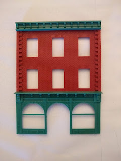
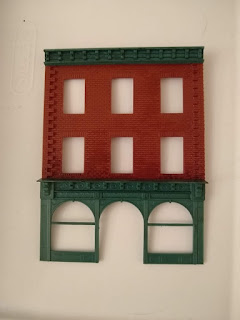
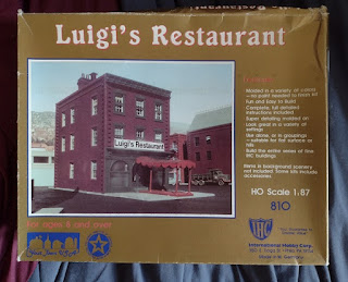
Luigi's Restaurant was one of a series of nearly identical kits offered by IHC.  AHM and Model Power offered similar kits, and I understand that all three companies used the same molds.  The kit contains four walls, separate windows, base plate, roof, and a sprue of architectural details that includes the front wall of the first floor storefront.  Optional extras, such as roof details and panels for bricking over a few of the windows, are also included.  Buildings like these are ubiquitous in the US, and probably in many international cities: basic, three-story brick structures with a storefront at ground level and offices or residences above.  Entry to the upper levels is through a door on the side, near the back, so an alley is necessary between neighboring units.  A few kits included a raised roof, bay windows, or other such details.

The kits are molded in four colors, so no painting is necessary - they're entry-level models, just above snap-fit.  Luigi's appealed to me as the first to look at, since the walls are molded in a dark red - I figured I could avoid painting altogether and move directly onto weathering.  More on that in a later post.  The green color looks to me like a weathered copper, too.

Since the windows are separately molded, they are easy to cut open, and it was this discovery that led me into a further exploration of the kit's possibilities as the foundation of a detailed, realistic model.

 I should point out that this is the second of these kits I've built.  Some 25 years ago I made and detailed one and gave it to a friend.  So, when I decided to get back into the hobby, this simple, familiar kit felt like a natural start.

In the second image, I've assembled the front wall, which is three pieces. The openings for the windows are obvious, but I haven't added them yet.  This shows the basic look of the kit, without any weathering applied, or any priming or paint.  I've used brush-on liquid styrene cement here, which I find works better than the thicker cement that comes in a tube.

If I were to do it again, I would prime the parts and paint them, even if I wanted the same colors.  Much too late, I realized that there is a slight sheen to the parts.  The sheen isn't severe, and I don't think anyone would look at it and say "that's shiny", but it does detract from the realism - it's obvious that something's wrong, even if it isn't obvious what exactly is wrong.

I would also plan out the interior, or its lack, before starting the exterior.  I knew that I wanted the storefront windows to say "Clyde Bruckman, Life Insurance," and that some of the windows should be open, and some fitted with air conditioners, but I hadn't made a decision about an interior.  As a result, I put the walls together without installing braces for internal floors, and adding those after the fact isn't feasible. Life is about making mistakes and learning from them.

Related, I got further along in my build process than is comfortable before deciding to add illumination.  Kits of this type are prone to light leaks at their seams and through the plastic (the walls will glow).  The solution is to paint the interior black, even if it's later painted another color; and to place an additional strip of plastic along the seams; but again, this should be done early in the process.  Whether painting the exterior walls will have the same result I don't know, but I didn't do so in this case.

The third image shows the same wall with some weathering.  All I've added is India ink diluted in rubbing alcohol.  The ink is an ancient bottle from Higgins (I think), and the rubbing alcohol is store brand. The ink settles into crevices, deepening them.  Used sparingly, it creates deeper shadows to give more weight to a model, but here I've painted it over the entire surface, in multiple dilute coats, to give a grimy, inner-city look.

I'll point out again that this is India ink, not calligraphy ink.  India ink can be diluted almost forever without the pigment particles becoming discrete.  If you dilute calligraphy ink too much you get blobs of pigment separated by clear areas with no pigment.  These days, there are inks specifically for modelling, which I expect have the infinitely-dilutable characteristics of India ink, but in colors beyond mere black.  Here, black is what I'm looking for so there was no need to look any further.  I used a large, soft-bristled bush here, overlapping each stroke with the next to avoid lap lines, without bothering to worry about how even the coat was.  As long as everything was wet, I was happy.  With multiple thin coats, an area that received less pigment on one coat will probably receive more on the next, and grime isn't even, anyway.

Next: more grime, and graffiti.